In the bustling urban landscape of Dhaka or the vibrant port city of Chittagong, your home is more than just a structure made of bricks and concrete; it is your sanctuary. After navigating the notorious traffic of Banani or the busy streets of Motijheel, stepping into your flat should feel like a warm embrace. It should speak to your soul and tell your story to the world.
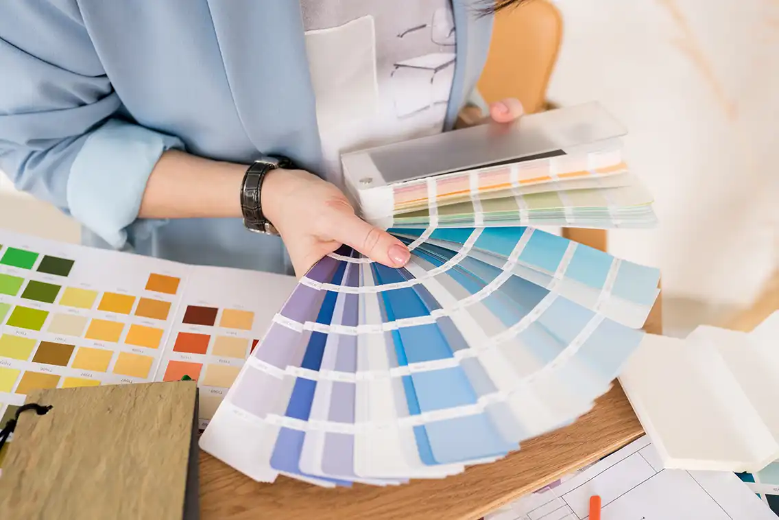
The most potent tool to achieve this atmospheric shift is color. Yes, colors can make or break feelings. They have the power to transform a cramped apartment in Dhanmondi into an airy retreat or turn a spacious villa in Gulshan into a cozy, intimate haven. However, amidst the thousands of shades available in the market, finding the “showstopper” for your home can be overwhelming.
Is there a right or wrong choice? Subjectively, no. But architecturally and aesthetically, especially within the context of interior design in Bangladesh, there are guidelines that ensure your home feels harmonious rather than chaotic. At DIT Studio, we believe in empowering homeowners with knowledge. Here is our comprehensive insider’s guide to curating a color palette that makes your space as unique as you are.
Understanding Color Psychology in the Bangladeshi Context
From the moment the sun rises over the delta, we are under the influence of color. Color psychology suggests that our surroundings dictate our mood. In a high-energy, fast-paced country like Bangladesh, your home needs to counter the external stress, not add to it.
The Warmth of Hospitality vs. The Cool of Serenity
In our culture, hospitality is paramount. We love to entertain guests. Therefore, common spaces often benefit from “social” colors. Warm neutrals, soft terracottas, or golden hues can evoke conversation and appetite. However, given our tropical climate with long, hot summers, there is a strong case for cooling colors.
- Yellows and Creams: These evoke happiness and optimism. They mimic sunshine, which is vital if your flat lacks natural light.
- Blues and Greens: These are nature’s neutrals. A soft teel or sky blue can mentally lower the temperature of a room, providing a psychological respite from the humid Dhaka heat.
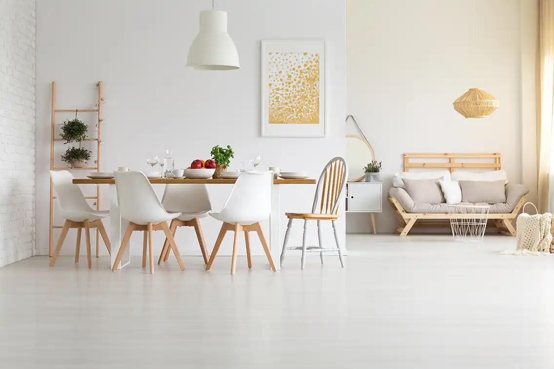
- Greys and Whites: The staples of modern minimalism. They provide a blank canvas that allows your furniture and art to take center stage.
Expert Tip: Be wary of dark, bold colors like absolute black or deep navy in small rooms. While they add drama, they can make a compact bedroom in Mirpur feel claustrophobic if not balanced correctly with lighting.

Navigating Natural and Artificial Light
One of the biggest challenges in home interior design in Bangladesh is lighting. Colors are deceptive; they are chameleons that change based on the light that hits them.
The Reality of Dhaka Flats
Unlike suburban homes in the West, many apartments in Dhaka are closely spaced. If you live on a lower floor in a dense area like Moghbazar or Kalabagan, direct sunlight might be a luxury.
- North-Facing Rooms: These receive soft, indirect light that can make colors look bluer or cooler. You might need warmer undertones (creams, beiges) to balance this.
- South-Facing Rooms: These get the most intense sunlight. Here, you can get away with cooler colors like greys or blues to balance the warmth.
The Artificial Light Factor
Since many homeowners rely on artificial lights in the evening, your color choice must look good under a bulb.
- Warm White (2700K-3000K): Makes reds and yellows pop. Ideal for living rooms and dining areas.
- Daylight/Cool White (4000K-6500K): Very common in Bangladeshi households, but it can make warm colors look muddy. If you prefer daylight bulbs, stick to crisp whites, greys, and blues.
The Climate Factor: Humidity, Dust, and Durability
When consulting for interior decoration in this region, we cannot ignore the climate. Bangladesh is humid, dusty, and prone to intense monsoons. This heavily influences not just the color, but the type of paint and finish you choose.
Battling the Monsoon Blues
High humidity can lead to dampness, especially on walls shared with bathrooms or exterior facades. Before applying that beautiful shade of lavender, ensure the surface is treated for dampness. We often recommend high-quality luxury emulsions with anti-fungal properties for our projects in Sylhet and Chittagong, where rainfall is heavy.
The Dust Dilemma
Let’s be honest: dust is a reality in our cities.
- Super Light Whites: While elegant, they show dust marks around switchboards and doorframes quickly.
- Dark Colors: Surprisingly, dark matte walls show dust even more than mid-tones.
- The Solution: Mid-tone neutrals (greige, mushroom, soft tan) are the most forgiving options for Bangladeshi homes. They hide minor imperfections and dust while keeping the space feeling bright.
Collective Decision Making for Multi-Generational Families
In Bangladesh, we often live in joint families or multi-generational households. This makes space planning and color selection a democratic process. If you live alone, the choice is yours. But in a shared space, what is “cool” to you might be jarring to your parents.
- Children: They thrive on stimulation. Bright, vibrant patterns in orange, lime green, or aqua spark creativity.
- Elders: They typically prefer traditional, calming, and neutral shades. Think earthy tones that remind them of nature.
- The Compromise: Do not make every room a different “theme park.” Find a middle ground for common areas—a neutral palette with textured wallpapers or art—while allowing personal bedrooms to reflect individual tastes.
Different Spaces, Different Purposes
As a premier interior design firm in Bangladesh, we approach every room based on its function.
The Living Room (Drawing Room)
This is where you make your first impression. In modern Bangladeshi apartments, the living and dining areas are often combined.
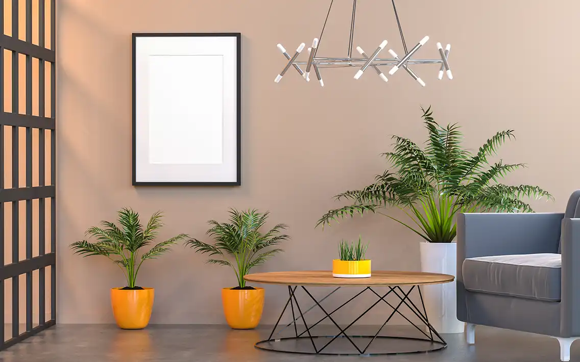
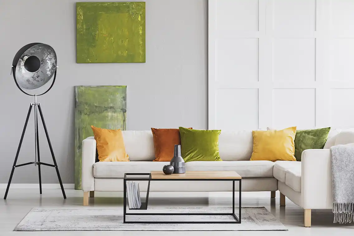
- Suggestion: Use a cohesive color palette to connect the spaces. Soft warm greys or creamy whites create a sophisticated backdrop for luxury sofas and chandeliers. If you want drama, use a feature wall with a textured finish or a deep royal blue, but keep the remaining walls neutral.
The Kitchen
The kitchen is the engine of the home. Given the heavy cooking style in our cuisine (using turmeric and oils), pristine white kitchens require high maintenance.
- Suggestion: Consider two-tone cabinets. Use darker colors (navy, charcoal, wood tones) for lower cabinets to hide wear, and lighter colors for upper cabinets to keep the space airy. Colors like citrus yellow or orange can stimulate appetite and energy.
The Bedroom
Sleep cycles in Dhaka are often disrupted by noise and city lights. Your bedroom should be a cave of tranquility.
- Suggestion: Soft blues, sage greens, or muted lavender. These colors are scientifically proven to lower blood pressure and induce sleep. Avoid energizing reds or bright oranges here.
The Prayer Room
A unique aspect of local homes is the dedicated prayer space.
- Suggestion: Serene whites, soft golds, or calming greens. The focus should be on spiritual peace, free from visual clutter.
Harmonizing with Local Materials and Furniture
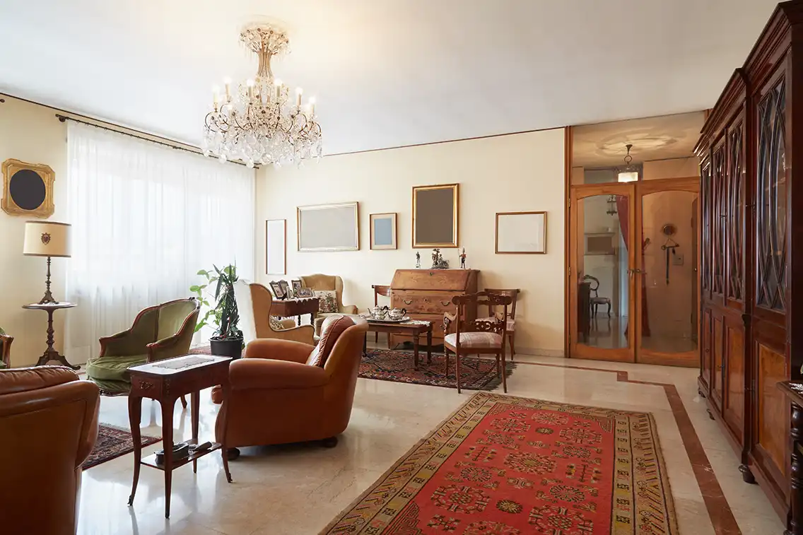
You cannot choose wall colors in isolation. You must consider what is already there. In Bangladesh, we have a deep love for wooden furniture—Segun (Teak), Gamari, or Mehagony. These woods have strong reddish, orange, or yellow undertones.
- The Clash: Painting a wall “cool blue” can sometimes clash with the “orange” tone of a Segun cabinet.
- The Harmony: Warm greys, off-whites, and greens complement natural wood beautifully. If you have traditional heavy wooden furniture, lighter wall colors help the furniture stand out without making the room look heavy.
Modern vs. Traditional Themes
Your color choice dictates the style of your interior.
The Traditional Look
If you cherish the vintage aesthetics of “Old Dhaka” or traditional Bengali heritage, showcase it through lively textiles. Nokshi Kantha wall hangings, Jute rugs, and Jamdani textures pair wonderfully with earthy terracotta or ochre walls.
The Modern Minimalist
Modern homes in new developments like Bashundhara R/A often struggle with space. To create an illusion of spaciousness, stick to a monochromatic palette. Pearl white, champagne, and cool greys make walls “recede,” making the room feel larger than it is.
5 Actionable Tips for Bangladeshi Homeowners
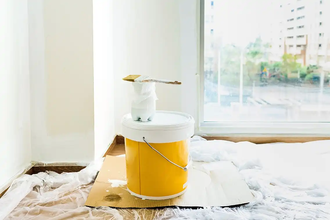
- Test Before You Paint: Never rely on the small paper chip card. Buy a sample pot and paint a 2×2 foot square on your wall. Watch how it changes from morning to night.
- Consider the Ceiling: In interior design, the ceiling is the “fifth wall.” In low-ceiling flats, paint the ceiling a shade lighter than the walls to give a sense of height.
- Flow is Key: If you can see the dining room from the living room, the colors must relate to each other. They don’t have to be identical, but they should be cousins, not strangers.
- Texture over Color: Sometimes, you don’t need a new color; you need texture. A cement-finish wall or a brick-cladding wall can add depth that flat paint cannot.
- Don’t Ignore the Floor: If you have standard white tiles (common in BD), you have flexibility. If you have patterned mosaic (common in older flats) or wooden flooring, your wall color must harmonize with the floor.
Conclusion
Choosing the right color combination is about more than just budgeting for paint buckets. It involves thoughtful consideration of your family’s lifestyle, the architectural limitations of your building, and the unique climate of our country. It is about creating a home that doesn’t look like a generic catalog page, but feels like you.
Don’t rush the process. Take notes, observe the light, and consult with professionals who understand the local nuances. If you are looking for a leading interior design firm in Bangladesh to help guide these decisions, DIT Studio is here to translate your vision into reality. We blend aesthetics with practicality to create spaces that stand the test of time.