Push the door open and a wall of vertical white fluting is what meets you, running floor to slab with a low cream sofa set against it. The second thing that registers is depth. Nothing tall stands between the threshold and the far window, so the room announces its full length in the first second, which is close to the only trick available to a living room in a flat of this size.
Every fixed element in here sits flat against a wall. That was settled at the elevation stage, before a single piece of loose furniture was chosen, because in 1,600 sq ft one cabinet projecting 400 mm into the walking route costs the room its whole character. What follows is the space in the order a visitor meets it, taken corner by corner from the entry door.
The First Metre Inside the Entry
The opening render is shot from just inside the door, and it carries the two decisions that set everything after them. The fluting is a shallow half round rib repeated across the full wall height in flat white, which pulls the eye upward the way a picture rail used to. The sofa answers by staying low, so more of that ribbed surface stays visible above the cushion line. No rug was laid. The floor runs unbroken from the threshold to the far skirting, and an uninterrupted floor is worth more here than any amount of layering.
The Wall Opposite the Sofa
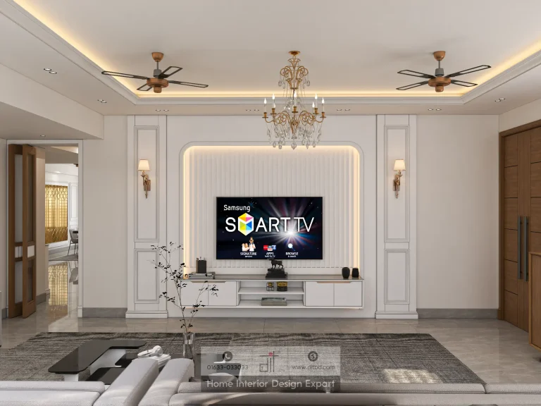
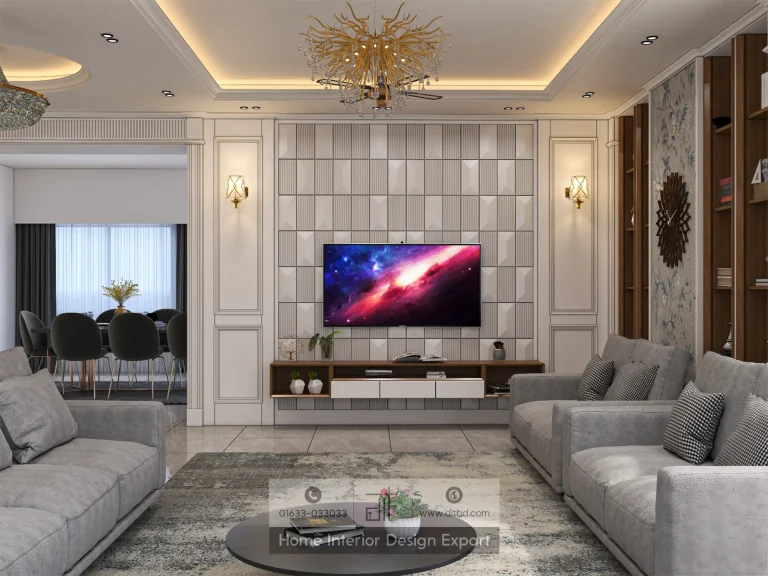
Turn a quarter left and the television wall arrives. Two renders frame it, one square on and one from the sofa’s own angle, and both show that the panel is a three dimensional wave relief rather than a printed board. The troughs run horizontally and change tone through the day as light crosses them. Below, a white console floats clear of the floor on concealed steel brackets, so the skirting line continues behind it and a mop passes underneath without anything being lifted.
Slim sconces sit either side of the panel at its own height rather than on the ceiling. Downlights would have washed the relief flat and left it reading as wallpaper. Light thrown sideways across a wave is what makes the shadow, and the shadow is the whole reason for specifying a moulded panel instead of paint. Good living room design in Dhaka tends to hang on one wall doing more work than the others, and here that wall is the one the sofa faces.
The Niche at the Sofa’s Left Shoulder
Shot from the dining end looking back, the second render picks up the only colour in the room. An arched reveal cut beside the seating holds a banana leaf mural in soft greens, lit from inside the arch so the leaves are brightest at the crown and fall away towards the base. Everything around it is white, cream or clear glass. A large print given an arched edge to stop at behaves differently from the same print run across an open wall, and in a room this width that edge decides whether it is a feature or an intrusion. Arched forms recur through this apartment, and the window bench in the modern master bedroom design in Uttara Sector 6 was drawn from the same set of curves.
Sheers, the Light Well and the Long Axis
The long render is taken with the camera almost in the doorway and it explains the plan better than a drawing would. Seating at the window end, the crystal chandelier at the centre of the ceiling and the door itself all line up on one axis. That alignment costs nothing and it is the reason the room reads longer than its dimensions. Windows in this block look into a light well rather than at open sky, so heavy drapes were never viable. Layered sheers filter what daylight arrives without subtracting from it, and they stack narrow against the reveal when pulled back.
Most flats we take on through our interior design service in Uttara have a light well somewhere in the plan, usually on the side the builder could not sell a view from. Treating that window as a source to be protected rather than a frame to be dressed is what keeps a compact living room from needing lamps at three in the afternoon.
The Glazed Side Towards the Dining Room
At the right hand end, frosted glass doors close the living room off from the dining room. Frosted rather than clear was chosen so the two rooms trade daylight without trading sightlines, which means a guest on the sofa is not looking straight at a dining table halfway through a meal. Folded back against the wall, the doors turn both rooms into one long space on the evenings when the two are needed as one.
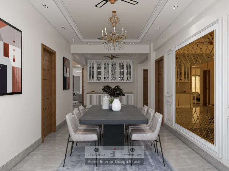
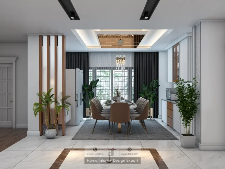
Nothing in this room stores anything beyond the console drawer, and that is deliberate. Crockery, glassware and the serving pieces that come out for guests all live next door in the modern dining room design in Uttara Sector 6. Everyday cooking storage stays behind a closed door in the modern kitchen design in Uttara Sector 6, where it belongs in a household that fries daily. Keeping both out of the living room is what lets these walls stay as quiet as they are.
Back at the Door, Looking In
Return to the threshold and the room resolves into three planes. White fluting on the left, the wave panel opposite the sofa, and the lit arch holding its single patch of green. Everything else is cream upholstery and floor. What holds it together is not a colour scheme but a rule about depth, since only three surfaces in this room are allowed to project and none of them projects by more than 40 mm. The 1,600 sq ft Uttara Sector 6 apartment project shows the same rule carried through the dining room, the kitchen and all three bedrooms, which is the fair way to judge whether it holds.
Planning a living room in a flat this size and unsure where the furniture should stop? Call us at 01633-033033 or book a free consultation today.