Here’s the truth no one tells you about choosing bedroom colors: the perfect shade doesn’t exist outside of your own vision.
Your bedroom is the most intimate, personal space you inhabit. It’s where you start your day and end it. The colors surrounding you in this space should reflect you, not an Instagram aesthetic or someone else’s idea of what a bedroom should look like.
Yet millions of people choose bedroom colors based solely on paint chips or online trends. They paint, live with it for a few months, feel unsettled, and repaint. The emotional dissonance they feel isn’t because they made a “wrong” choice-it’s because they didn’t align the colors with their actual emotional needs and personal style.
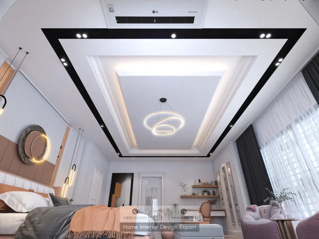
At DIT Studio, we’ve designed hundreds of bedrooms across Dhaka, and the most successful ones share one characteristic: the colors are authentically chosen, not arbitrarily selected. The person living in the space feels seen by it, supported by it, comforted by it.
This article helps you navigate color choices with intelligence-understanding both current trends and timeless principles, recognizing how colors affect your psychology and sleep, and ultimately trusting your instincts in creating a space that genuinely serves you.
Why Bedroom Color Matters More Than You Think
Close your eyes and imagine stepping into your bedroom. What colors do you see? How do those colors make you feel? Calm? Energized? Uninspired? Anxious?
That feeling is real and rooted in how your brain processes color. Your bedroom color palette influences your mood every single time you enter that space. Over days, weeks, months, this repeated emotional experience accumulates. Colors either support your wellbeing or subtly undermine it.
The psychology is measurable. Colors stimulate different neural responses. Blues and greens calm your nervous system. Warm oranges and reds increase heart rate and energy. Neutral tones ground you. Different people respond differently to the same color, but the fundamental principle is scientific: color affects your physiology and psychology.
A second factor: perceived space. Colors literally affect how large a room feels. Light colors recede visually, making small bedrooms feel more spacious. Dark colors advance visually, making rooms feel smaller. In Dhaka apartments where every square meter matters, color choice directly impacts whether a bedroom feels cramped or open.
The most common mistake: choosing colors from paint chips or swatches. Paint samples viewed under store lighting look completely different in your bedroom with your actual natural light and surrounding furniture. What looks peaceful in the showroom might feel cold in your space.
Here’s DIT Studio’s philosophy: your bedroom should feel like your retreat, not a magazine spread. That means understanding both current design trends and your personal emotional needs-then choosing colors that serve you.
2026 Bedroom Color Trends Worth Considering
Understanding what’s trending helps you make informed choices about longevity. Some trends reflect deeper shifts in design philosophy that stick around for years.
Warm Neutrals: The Dominant Trend
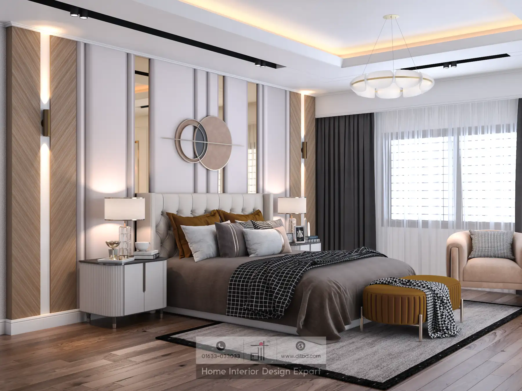
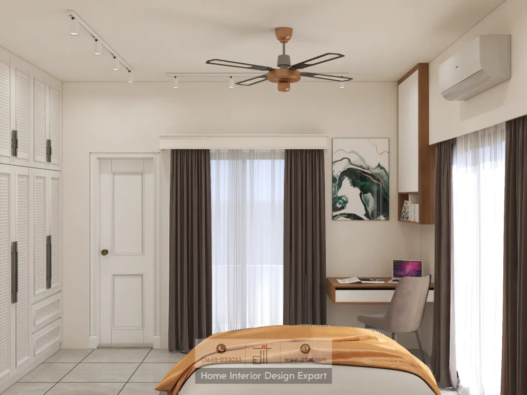
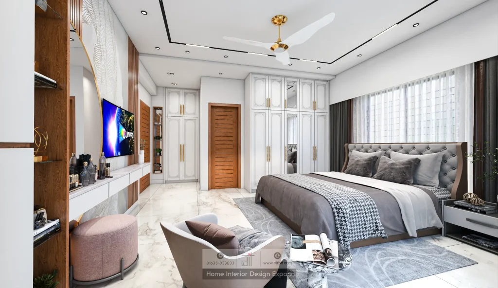
Warm neutrals-warm grays, soft taupes, warm beiges, creamy whites with warm undertones-are absolutely dominant in 2026. This reflects a significant shift from the cool grays and harsh whites of recent years. People are craving coziness and comfort. The sterile, minimal aesthetic is giving way to spaces that feel lived-in, warm, and welcoming.
Benefits are substantial: Warm neutrals feel innately calming. They create visual cohesion. They work across multiple design styles. They won’t feel dated in five years. DIT Studio often recommends warm neutrals as base colors because they provide a sophisticated foundation. Everything you add-custom wardrobes, lighting, art, bedding-looks better against warm neutral walls.
Rich, Deep Jewel Tones: The Personality Play
Emerald green, sapphire blue, deep plum, rich burgundy-jewel tones are having a moment. After years of “minimalist white everything,” people are deliberately choosing colors that make a statement. This trend reflects a move toward personalization and away from generic interiors.
The psychology is powerful: Jewel tones feel luxurious, grounding, and creative. Unlike primary colors, jewel tones have depth and subtlety. A deep emerald green feels calming and natural, not artificial.
The caution: Jewel tones need proper support. Harsh overhead lighting in a deep jewel-tone bedroom creates a cave-like feeling. But with proper lighting design-warm ambient light, strategic accent lighting, good task lighting-jewel tones create stunning, personalized spaces. For guidance on pairing jewel tone walls with proper lighting, see “How Lighting Transforms Your Bedroom“
Earthy & Nature-Inspired Colors
Terracotta, olive green, soft sage, warm ochre-earth colors are trending as part of biophilic design (design that connects us to nature). This trend is particularly relevant for Dhaka, where natural materials have deep cultural roots. Earthy bedroom colors can bridge modern design with traditional Bangladeshi sensibilities, creating spaces that feel authentic and grounded.
Warm White with Depth: Evolved Minimalism
The trend isn’t stark white but white with warm undertones-creamy, off-white, whites that feel soft rather than sterile. This works beautifully for small Dhaka apartments because it maximizes light (making spaces feel larger) while avoiding the cold, clinical feeling of pure white.
Color Psychology: How Bedroom Colors Affect Sleep & Mood
Let’s get specific about how different color families affect your actual sleep quality and emotional state.
Cool Tones: Blues & Greens
Blues and greens are calming, restorative colors. They lower blood pressure and heart rate. They promote sleep. They create a sense of peace and safety. Blue is associated with water and sky-elements our brains recognize as calming. Green is associated with nature, growth, and renewal.
Best for: People with high stress, light sleepers, those who struggle to unwind.
Caution: Very cool, artificial blues can feel cold. Choose softer, more muted blues with warmth to them. A soft blue-gray or blue-green (teal-leaning) feels calming without coldness.
Warm Neutrals: Beiges, Taupes, Warm Grays
These colors are psychologically associated with comfort, safety, groundedness, and trustworthiness. They feel neither stimulating nor boring-the Goldilocks of colors. This is why warm neutrals work for almost everyone.
Best for: Most people, especially those seeking safety and stability.
Versatility: Warm neutrals work with any design style. They feel elegant without trying and never feel dated.
Warm Colors: Terracotta, Warm Orange, Soft Red
Warm colors activate your nervous system and increase energy. A bright orange is stimulating; a soft, dusty orange-red feels cozy and intimate. The distinction matters. Saturated warm colors are overstimulating for bedrooms. But muted, soft warm colors create intimacy and warmth.
Best for: Creating intimate, cozy, welcoming feelings. Works well for those who run cold or want their bedroom to feel personally inviting.
Caution: Avoid highly saturated warm colors. Choose soft, dusty versions.
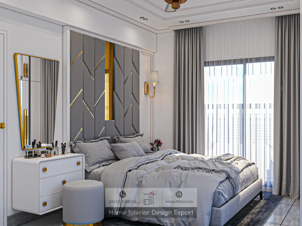
Jewel Tones: Deep Emerald, Sapphire, Plum
Jewel tones feel luxurious, sophisticated, and grounding. They evoke depth and creative thinking. They create a sense of belonging and security.
Best for: Those seeking bold personal expression, wanting their space to feel intentional and sophisticated.
Critical consideration: These colors must be paired with proper lighting. In dim, poorly lit rooms, jewel tones feel dark and gloomy. But with warm, adequate lighting, they’re stunning.
The Dhaka Consideration
Dhaka’s hot, humid climate and specific light patterns matter. Lighter, cooler tones can feel refreshing and help spaces feel open. But personal comfort always trumps climate trends. If you’re drawn to warm, cozy colors, proper ventilation and thoughtful lighting make them work beautifully even in warm climates.
How Lighting Reveals (and Changes) Your Color Palette
Here’s something most people don’t understand: the color you see in daylight is not the same color you see under artificial light.
Natural light at different times of day-morning sun, afternoon sun, diffused overcast light-reveals true color. It’s your most honest light source.
Warm artificial light (2700K) enhances warm tones and can dull cool tones. That cool blue-green you loved in the showroom might look muted in warm bedroom lighting. Cool artificial light (4000K and above) emphasizes cool tones and can wash out warm colors.
This is why paint samples alone don’t work. The store’s lighting isn’t your bedroom’s lighting. What looks perfect there feels different at home.
DIT Studio’s 3D visualization advantage is transformative here. We don’t just show you colors; we show them in your actual lighting conditions. You see how your chosen colors look under warm evening light, under natural daylight from your specific windows, with the furniture and fixtures you’ve selected. This visual confirmation eliminates the risk of choosing a color that looks disappointing once installed.
The practical step: Get paint samples and observe them throughout the day-morning, afternoon, evening-in your actual lighting conditions. How does the color shift? Does it still appeal to you under all scenarios?
Combining Colors: The Art of Bedroom Palettes
You rarely choose just one color. You’re creating a palette. Understanding how colors work together determines whether your bedroom feels cohesive or chaotic.
Monochromatic Palettes: Variations of One Color
A monochromatic palette uses different shades of a single color. Walls in warm gray, ceiling in lighter gray, accents in charcoal-all from the gray family.
Benefits: Deeply sophisticated, inherently cohesive, calming, timeless.
Consideration: Monochromatic can feel boring if not handled carefully. Break it up with texture variation to keep visual interest.
Complementary Palettes: Colors Opposite on the Color Wheel
Complementary colors create visual dynamism and interest when balanced properly. Example: soft blue-green walls with warm terracotta accents (in artwork, textiles, or a headboard). This feels balanced and interesting without chaos.
Benefits: Visual interest, balanced, dynamic without overwhelming.
Consideration: Ensure one color is dominant (walls) and the other is secondary (accents).
Analogous Palettes: Colors Next to Each Other
Analogous colors sit adjacent on the color wheel (blue, green, blue-green). They’re naturally harmonious.
Example: sage green walls, soft blue-green accents, warm white ceiling and trim.
Benefits: Harmonious, flowing, naturally cohesive, deeply calming.
Neutral + Accent: Neutral Base with One Bold Color
A neutral base (walls in warm white or warm gray) with one bold accent color (through furniture, headboard, artwork, textiles).
Example: warm white walls, emerald green custom headboard or wardrobe, gold lighting fixtures and accents.
Benefits: Flexible, personal, allows your bedroom to evolve. Not overwhelming.
Consideration: The accent color must be chosen carefully. It will set the emotional tone of the space.
Dhaka-Inspired Palettes
Consider incorporating local architectural traditions and natural materials. Warm beige or cream walls (honoring traditional architecture) with deep teal or jewel-tone accents (a modern reinterpretation of traditional textiles), natural wood tones, and jute textures. This feels grounded, authentic, and locally relevant while remaining contemporary.
Choosing Your Palette: A Personal Framework
Now for the practical work of choosing colors authentically.
Step 1: Assess your emotional needs
Close your eyes and imagine your ideal bedroom feeling. Do you want to feel calm and grounded? Energized and creative? Cozy and intimate? Write down three emotional words that describe how you want your bedroom to feel. These emotional anchors guide color selection more accurately than trends.
Step 2: Consider your existing investment pieces
Do you have furniture you’re keeping? What colors are they? Your new palette must work with existing pieces. If you’re designing completely custom (including furniture from DIT Studio), you have unlimited palette options.
Step 3: Factor in your room’s natural light
Spend a few days observing your bedroom’s natural light. Does it lean warm or cool? Are you getting morning sun, afternoon sun, or mostly diffused light? This affects how walls look.
Step 4: Test with samples
Get paint samples and paint large swatches directly on your walls (not tiny cards). Observe them at different times of day, under your lighting conditions. Live with them for at least a few days. Notice which colors you feel drawn to repeatedly.
Step 5: Apply the 70-20-10 rule
Choose a dominant base color (70% of the room-walls), a secondary color (20%-perhaps another wall or a large accent like a headboard), and an accent color (10%-artwork, textiles, accessories). This proportion feels balanced and intentional.
Step 6: Include texture variation
The same color feels different on matte paint versus textured wallpaper versus natural wood. Include varied textures to prevent monotony.
At DIT Studio, this color planning is integral to our space planning service. We help you assess your emotional needs, explore your natural light, test colors in context, and ultimately choose a palette that’s both personally meaningful and design-smart.
Living with Your Colors: Sustainability & Evolution
Here’s what clients worry about: “What if I choose the wrong color and hate it in six months?”
The reassuring truth: color preferences evolve naturally, and walls can be repainted. Your bedroom doesn’t have to be perfect forever-it can evolve with you.
- If you’re choosing a bold color and uncertain: Start with a wall that’s easy to repaint. Or use an accent approach-neutral walls with bold color through a custom headboard, which is easier to change than repainting.
- If you’re choosing with long-term comfort in mind: Go with warm neutrals for walls (longevity) and add personality through textiles, art, lighting, and custom furniture. These are easier to change than wall color.
- The investment perspective: Well-chosen bedroom colors enhance sleep quality and daily wellbeing-invaluable benefits. They also increase home value. Your bedroom color choice isn’t an expense; it’s an investment in your quality of life. When you choose custom furniture (like a wardrobe or headboard from DIT Studio), you’re choosing color deliberately in a piece you’ll keep for years.
Next Steps: Designing Your Bedroom Color Story
The journey from “I want to repaint my bedroom” to “I love the colors in my bedroom” involves understanding trends, recognizing your emotional needs, observing your room’s light, testing colors carefully, and trusting your instincts.
The goal isn’t to choose the “right” color-it’s to choose colors that authentically serve you. No generic color schemes. Your bedroom should be authentically yours.
Ready to create the bedroom color palette of your dreams? Gather inspiration images. Notice which colors you’re consistently drawn to. Test paint samples in your actual space. Then connect with DIT Studio to transform your vision into reality.
Let DIT Studio bring your color vision to life. We’ll help you choose colors that work with your style, lighting, and lifestyle-and show you exactly how they look in 3D before we execute.
Our space planning service also includes comprehensive guidance on coordinating colors with storage solutions-see “5 Practical Storage Solutions for Small Bedrooms in Dhaka Apartments” Schedule your free consultation today, and let’s create a bedroom you genuinely love.
FAQs: Choosing Bedroom Colors
Q1: What’s the difference between “warm white” and “cool white” paint, and which works better for small bedrooms?
Warm white (with yellow or beige undertones) feels cozy and intimate, while cool white (with blue undertones) feels fresh and clean. For small bedrooms, warm white is generally better because it maximizes the feeling of spaciousness while avoiding the cold, clinical feeling of pure white.
However, cool white works if your bedroom gets ample natural light. The best approach: get paint samples from both categories, observe them in your actual lighting throughout the day, and choose the one that feels most inviting in your space. Warm white is typically preferred for evening relaxation and sleep.
Q2: Can I use bold jewel tones in a small Dhaka bedroom without making it feel cramped?
Absolutely-but strategic implementation is crucial. The key is limiting jewel tones to accent walls or specific elements (like a custom headboard or wardrobe) rather than painting all four walls. Use jewel tones on one wall with complementary neutral walls, and ensure you have proper lighting (warm ambient light is essential-jewel tones in dim rooms feel cave-like).
In 80-100 square foot bedrooms, we recommend jewel tones on one accent wall with 3 neutral walls. This gives you personality and sophistication without overwhelming the space.
Q3: How do I know if my color choice will feel dated in 3-5 years?
Trends change, but certain color families remain timeless. Warm neutrals (warm grays, taupes, warm beiges) are almost never dated because they’re always neutral. Jewel tones (deep emerald, sapphire, plum) also stay relevant because they’re sophisticated rather than trendy. Very trendy colors like “millennial pink” or highly saturated colors date quickly.
The safest approach: choose warm, muted tones for your walls (these are timeless), then add personality through accent colors in artwork, textiles, and custom furniture, which are easier to change. This gives you long-term stability with flexibility for evolution.
Q4: What’s the best way to use paint samples before committing to a color?
Get samples from multiple paint vendors and paint large swatches (at least 12″x12″) directly on your bedroom walls in different areas-near windows, in darker corners, on different walls. Observe them throughout the day (morning, afternoon, evening) under your natural and artificial lighting.
Live with them for at least 3-5 days. Notice which colors make you feel happy and calm when you wake up or wind down in the evening. This real-world observation is far more accurate than imagining colors from a paint chip. Most people discover their true preference within a week of living with samples.