One table here has to do three separate jobs. It feeds the family every day of the week, it absorbs the overflow when the front room fills with guests, and it forms the link between the living end of the flat and the kitchen. Rooms asked to do three things usually end up doing none of them properly.
In an apartment laid out as one continuous run, the specific risk was that the dining space would read as a wide corridor with furniture parked in it. The answer was to plan two counters at different heights, under two different qualities of light, rather than one dining set stranded in the middle of the floor.
The palette answers to the rest of the flat, the same white cabinetry set against stone and brass, though the lighting sits lower here and reads warmer. Everything below is a problem and the built response to it, which is why our common space design service starts with counts and habits rather than with furniture.
One Table, Everyday Meals and Guest Overflow
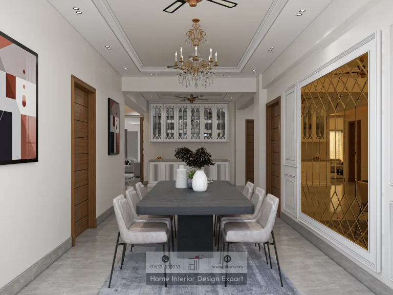
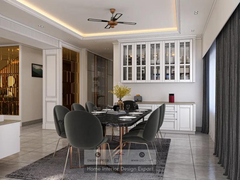
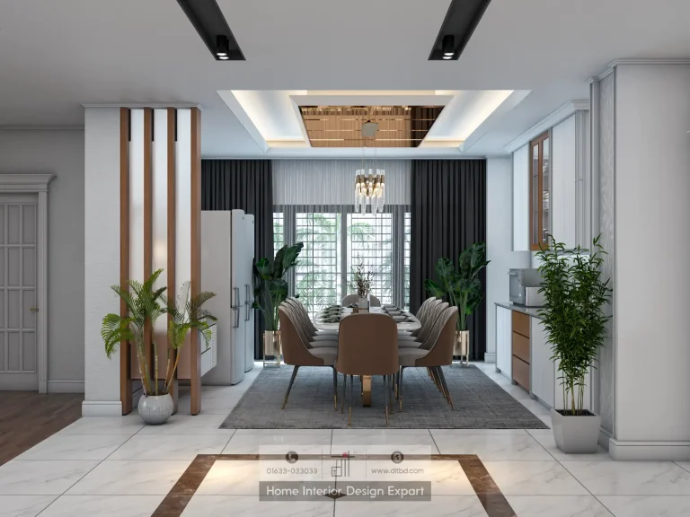
The main table is marble topped on a slim profile, with the stone edge eased rather than bullnosed so it does not look heavier than it is. The chairs wear a warm neutral cloth pitched to agree with the brass rather than argue with it, and they are narrow enough across the back that an extra pair can be brought in from the breakfast bar when numbers rise. A round gold mirror on a marble panel faces the table from the side wall, which puts light back across the surface on days when the curtains at the far end are closed. Nothing on the table is fixed, so the room can be reset for a large gathering in about ten minutes.
Sizing the Chandelier So No Seat Sits in Shadow
A brass six arm chandelier centres over the table, and its outer arms were specified to finish inside the stone edge on both long sides. That measurement is worth more attention than it usually gets. A fixture that oversails the table looks wrong from every chair, and an undersized one drops the two end settings into gloom while the middle stays bright.
Drop height was set on site against the real ceiling, not taken from a catalogue elevation, and the cove lighting above the cabinetry was deliberately kept dim so the table stays the brightest surface in the room. The arms carry candle lamps rather than shades, which puts a small hard source at each point of the fitting and throws the brass into relief instead of flattening it. Heights were resolved room by room across the flat, which is why the ring pendants in the modern boys bedroom design in Basabo hang at bedside height while this one stops well above standing eye level.
Adding a Second Counter Without Losing Floor
At the far end stands a breakfast bar built as a fluted timber island in a mid tone, topped in marble. Running the flutes vertically lifts a mass that would otherwise sit low and heavy on the floor. Above it a crystal bar fitting is linear rather than round, matched to the counter beneath instead of copying the shape used over the table. This is the informal end, used for tea, quick meals and homework, and it earns its footprint by taking traffic that would otherwise land on the dining table. Behind it, folding doors open into the modular kitchen design in Basabo, so food travels a few steps rather than across a room.
Storing Crockery Where Dust Cannot Reach
A run of white crockery cabinets lines one wall with glazed upper doors. Clear glass was used instead of frosted, which turns the crockery itself into the decoration, and every cabinet carries an internal light on its own circuit so one can be lit for dinner without switching on the rest. The units are built hard to the wall and scribed in, not stood against it, which removes the dust gap that collects behind freestanding display furniture. Beside them a white shelf column carries plants and a few objects under a crystal drum fitting. Dining storage of this depth is still uncommon in home interior design in Dhaka at any budget, and it is the single reason the table itself stays clear all day.
Stopping the Room Reading as a Corridor
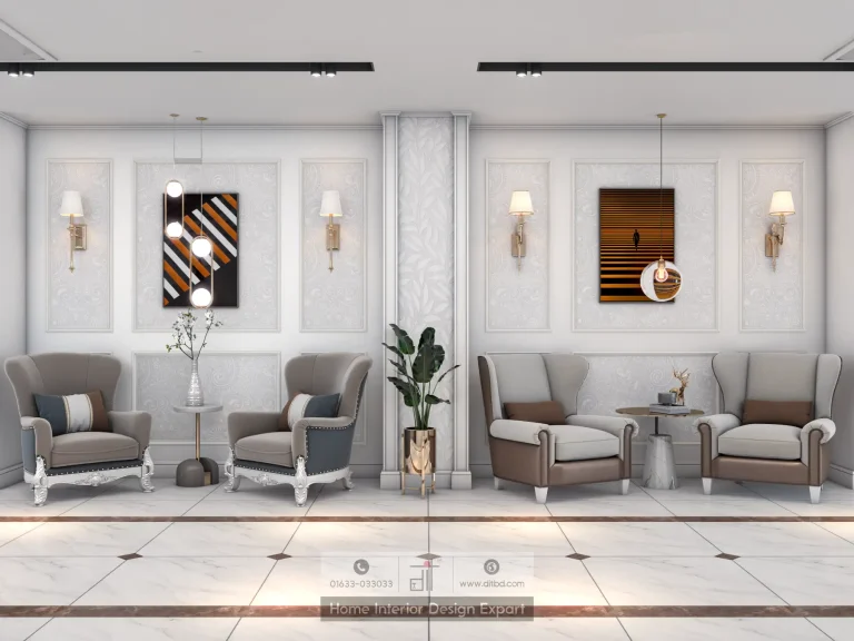
Two framed pieces hold the ends of the room, an ocean scene that meets you first on the walk in from the corridor and a mountain landscape on the angled wall by the cabinets. Both were hung to sit in the eye line of someone walking, not someone seated, because this room is crossed far more often than it is occupied.
From the corridor you see straight through the table to the breakfast bar and the artwork past it, and the eye reads depth rather than length. The floor helps. Large format marble tile runs in one direction through both ends of the room with the joints aligned, so nothing in the surface underlines the long axis. Walk the corridor on the 3,000 sq ft Basabo apartment project and the same framed view repeats at each doorway, which is what makes the plan feel connected instead of chopped into boxes.
What This Room Would Teach a Similar Flat
Most dining rooms in Dhaka fail on two things, and neither of them is the table. They fail on hanging height and they fail on storage. Set chandelier drops against the ceiling you actually have, build crockery units into the wall instead of buying them, and split the fixtures onto enough circuits that lunch and dinner do not need the same light. The brass family used here carries on through the fittings in the luxury master bedroom design in Basabo, so the flat holds one metal from the front door to the far bedroom. Everything else in this room is furniture, and furniture can be changed later without touching a drawing.
Send us your crockery count and we will size the storage to it. Call us at 01633-033033 or book a free consultation today.