Clothing in a teenager’s room roughly doubles between twelve and eighteen. A wardrobe sized for the child in the room on handover day is full within two seasons, and everything after that ends up on a chair. This room was drawn against the later number rather than the current one.
That decision produced an open walk in closet section instead of a standard four door unit, and it set the proportions of everything else on the wall. The palette runs beige and white with thin gold striping and brown curtains. There is no pink and nothing themed, because a themed room has to be redone in four years.
The Count Before the Cabinet
Before any joinery was drawn we counted what actually had to go in: hanging length in metres, folded stack heights, shoe pairs, bags, the winter things that only come out for two months. That audit is unglamorous and it is the whole design. Hanging heights allow full length dresses down one side and doubled shorter garments on the other, and each drawer depth was set by what was going into it rather than by a standard module. Counting first is the same habit that produced two kitchens rather than one in the modular kitchen design in Gulshan 2.
A wardrobe sized by allowance rather than by count is the most common failure in a child’s bedroom, and it shows up as an untidy room that everyone blames on the child. The same reasoning runs through our bedroom interior design in Dhaka, applied at different ages and different budgets.
An Open Closet That Has to Stay Presentable
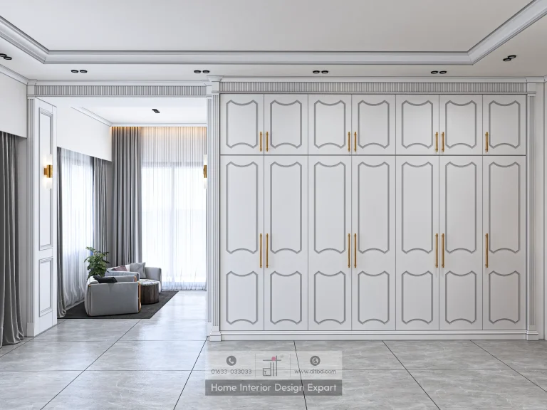
The wardrobe wall is white panelled with one section left open as a walk in closet. Open storage is a commitment, since it only ever looks good when it is kept in order, so the open bay is limited to hanging while every folded item lives behind a door. Nothing that gets stacked, and therefore nothing that gets messy, is on display.
The bay is lit from a strip behind the front upstand rather than from a downlight in the ceiling, so the light falls on the clothes instead of on the top of the rail. A ceiling fitting in an open closet lights the rail and shadows everything hanging under it, which is the opposite of what the bay is for.
The panelled fronts repeat the door profile used through the rest of the apartment, including the formal rooms shown in the luxury living room design in Gulshan 2, so the room sits inside the flat rather than reading as a separate project. Panel proportions were adjusted to the shorter door height here, which is the detail that usually gets missed when a profile is carried between rooms.
Warmth Without Colour in a Room With No Theme
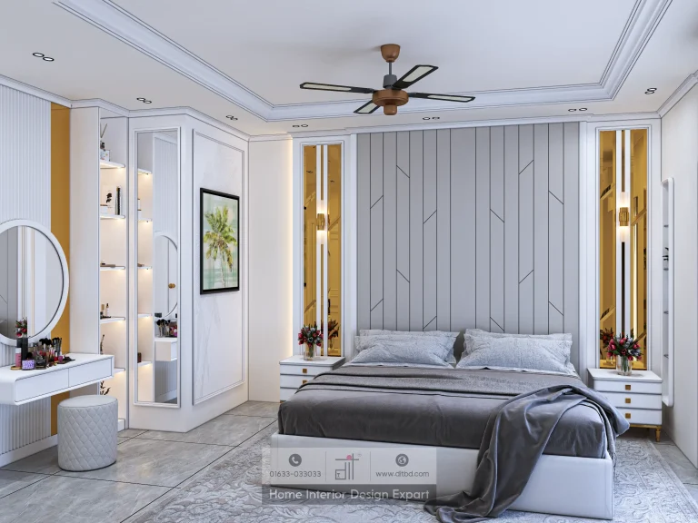
A fluted beige headboard wall runs behind the bed, with a gold striped panel above it and a lit display niche to one side. Beige rather than white was the difference between a room that feels warm at seven in the morning and one that feels clinical, and it separates this room from the grey used in the master suite next door.
The gold striping is thin. From the bed it registers as texture on the wall. From the doorway it resolves into a pattern. Working a wall at two reading distances like that is how you get interest into a room without adding a colour that a fifteen year old will want changed.
One Texture, Two Sizes
A white fluted dresser sits opposite the bed, repeating the headboard ribbing at a smaller scale on a smaller piece. Taking one texture and using it at two sizes makes a room feel considered without introducing a second material, which is useful in a child’s room working on a fraction of the budget a shared space like the luxury dining room design in Gulshan 2 carries.
Behind the dresser, layered brown curtains hang to the floor and a classic panelled door closes the room. Brown rather than beige at the window keeps the corner from disappearing into itself, and gives the fluting something to sit against.
Light on the Face, Not the Back of the Head
The dressing table carries a tall mirror with a curved stool, placed beside the floor length sheers rather than against a solid wall. Daylight then arrives on the face from the side and diffused, which is both the most flattering and the most practical arrangement for anyone actually using a mirror to get ready.
Put the same mirror on the wall opposite a window and you sit permanently backlit. It is a small planning decision that costs nothing while the layout is still open and cannot be fixed afterwards without moving the joinery.
Advice for a Parent Planning the Same Room
Two things carry over to any flat. Size the storage against a real count rather than a standard allowance, and keep the decoration in texture and finish rather than in colour, so the room can grow up without being rebuilt. Both cost nothing extra while the drawings are still open, and both turn up in the children’s rooms listed under our interior design service in Gulshan.
Seen inside the 3,000 sq ft Gulshan 2 apartment project, this room sits in the family wing at the quiet end of the corridor. Door profile, handle height and floor level run continuously along that corridor, so nothing announces the change from shared space to private room except a closed door.
Sizing storage for a room that still has years of growing left in it? Call us at 01633-033033 or book a free consultation today.